Gonzalo Sulbaran
bank marketing Project
Project maintained by gonzasul Hosted on GitHub Pages — Theme by mattgraham
bank_marketing
bank marketing Project — title: “Bank Marketing Project” Autor: Gonzalo Sulbaran —
The data is related with direct marketing campaigns of a Portuguese banking institution. The marketing campaigns were based on phone calls. Often, more than one contact to the same client was required, in order to access if the product (bank term deposit) would be (‘yes’) or not (‘no’) subscribed.
Task
Explore the data to find how different features (age, job, education, and others) affect the desired outcome (the client subscribed to a term deposit). For this analysis, I will use a marketing KPI called Conversion Rate. Conversion rate is the percentage of clients who take the desired action. Give recommendations for the Bank’s marketing strategy and future marketing campaigns.
Loading the data and R packages
library(dplyr)
library(ggplot2)
data <- read.csv("C:/Users/gonza/Downloads/bank marketing project in R/bank-additional-full.csv", header = TRUE, sep = ";")
head(data)
The column “y” has binary values “yes” and “no” (subscribed to a term deposit). I’m going to encode it into 1s and 0s. After that, I can easily calculate the converstion rate.
data <- data%>%
  mutate(y=ifelse(y=="no",0,1))
data$y <- as.integer(data$y)

#total number of conversions
sum(data$y)

#total number of clients in the data
nrow(data)

#conversion rate
(sum(data$y)/nrow(data))*100
Now that I found the conversion rate of this data set 11,26%, let’s find conversion rates depending on the different data features.
Conversion Rate by Age
#group clients into 6 groups(18-30, 30-40, 40-50, 50-60, 60-70, >70)
ConversionsRateAgeGroup <- data %>%
group_by(AgeGroup=cut(age, breaks = seq(20,70, by=10))) %>%
summarize(TotalCount=n(), NumberConversions=sum(y)) %>%
mutate(ConversionRate=(NumberConversions/TotalCount)*100)
#rename de 6th group
ConversionsRateAgeGroup$AgeGroup <- as.character(ConversionsRateAgeGroup$AgeGroup)
ConversionsRateAgeGroup$AgeGroup[6] <- "70+"
#visualazing conversions rate by age group
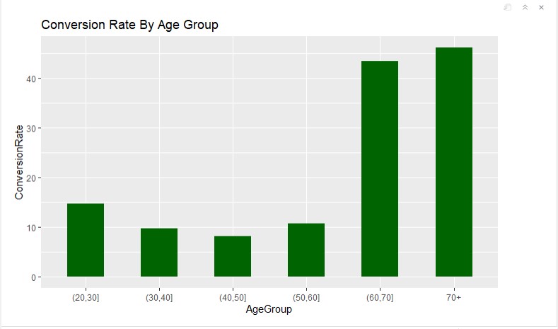
ggplot(data=ConversionsRateAgeGroup, aes(x=AgeGroup, y= ConversionRate)) + geom_bar(width = 0.5, stat = "identity", fill = "darkgreen") + labs(title = "Conversion Rate By Age Group")
As we can see on the plot, 60+ age people responded better to the bank marketing campaign compared to the other age groups
Conversion Rate By Marital Status
# group the data

ConversionsAgeMarital <- data %>%
  group_by(AgeGroup=cut(age, breaks = seq(20,70, by=10)), Marital=marital) %>%
  summarize(Count=n(), NumConversions=sum(y)) %>%
  mutate(TotalCount=sum(Count)) %>%
  mutate(ConversionRate=NumConversions/TotalCount*100)

#rename the Last Groups
ConversionsAgeMarital$AgeGroup <- as.character(ConversionsAgeMarital$AgeGroup)
ConversionsAgeMarital$AgeGroup[is.na(ConversionsAgeMarital$AgeGroup)] <- "70+"

#visualazing conversions rate by age group and marital

ggplot(ConversionsAgeMarital, aes(x=AgeGroup, y=ConversionRate, fill= Marital)) + geom_bar(width = 0.5, stat = "identity") + labs(title = "Conversion Rate by Age and Marital Status")
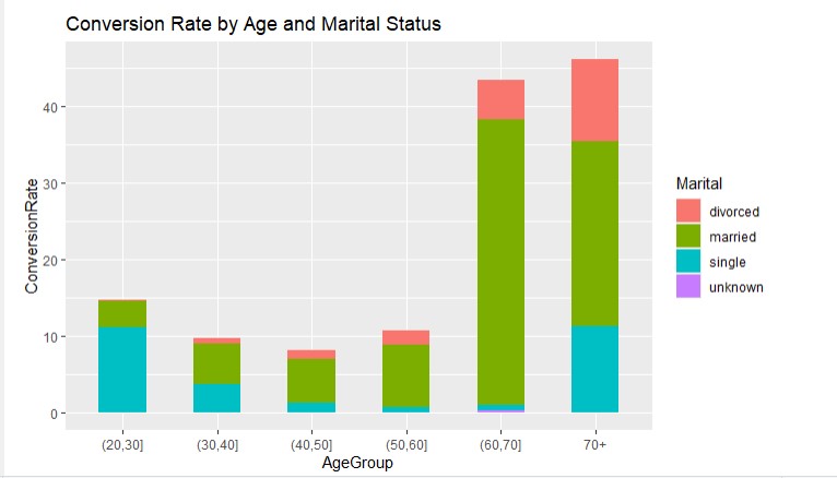 In the groups from 30 to 70+ age, married people are more likely to convert (could be because they are the majority in these age groups). People with the “single” marital status convert better in the age group {20, 30].
Conversions By Job
conversionsJob <- data %>%
  group_by(Job=job) %>%
  summarize(TotalCount=n(), NumberConversions=sum(y)) %>%
  mutate(ConversionRate=NumberConversions/TotalCount*100) %>%
  arrange(desc(ConversionRate))

conversionsJob$Job <- factor(conversionsJob$Job, levels = conversionsJob$Job[order(-conversionsJob$ConversionRate)])

#visualazing the jobs DESC for the bar chart

ggplot(conversionsJob, aes(x=Job, y=ConversionRate)) + geom_bar(width = 0.5,stat = "identity", fill= "darkgreen") + labs(title = "Conversion Rate By job Status") + theme(axis.text.x = element_text(angle = 90))
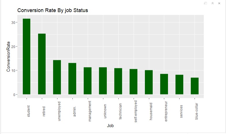
Students and retired people have a higher conversion rate than other “job” groups. The blue-collar group has the lowest conversion rate.
Conversions by Education
#group the data
conversionsEdu <- data %>%
  group_by(Education=education) %>%
  summarize(TotalCount=n(), NumberConversions=sum(y)) %>%
  mutate(ConversionRate=NumberConversions/TotalCount*100) %>%
  arrange(desc(ConversionRate))

#order DESC for the bar chart
conversionsEdu$Education <- factor(conversionsEdu$Education,
                                   levels = conversionsEdu$Education[order(-conversionsEdu$ConversionRate)])
#visualizing conversions by education
ggplot(conversionsEdu, aes(x=Education, y=ConversionRate)) +
  geom_bar(width=0.5, stat = "identity", fill="darkgreen") +
  labs(title="Conversion Rates by Education") +
  theme(axis.text.x = element_text(angle = 90))
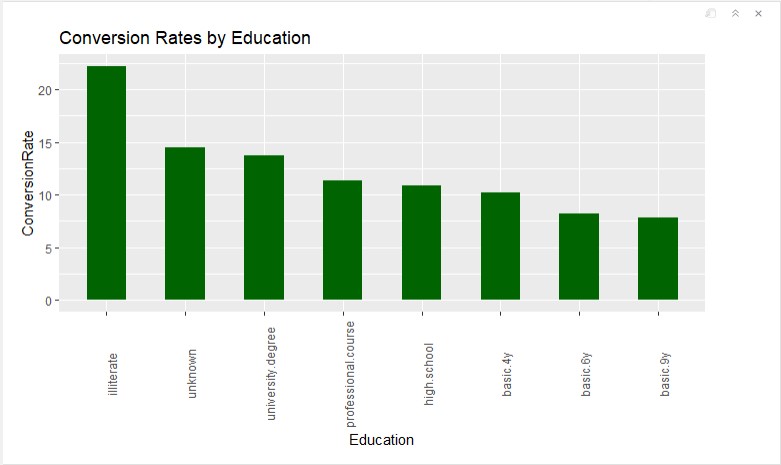
The highest conversion rate in the “illiterate” group. But because there are only 18 illiterate clients, I am not going to recommend focusing on this group. “University degree” has a higher than average conversion rate, so I would suggest focusing on this group. Also, I would recommend limit marketing efforts on groups “basic.6y” and “basic.9y”
Conversions by having or not a credit in default
#group the data
conversionsDefaultCredit <- data %>%
  group_by(HasCredit=default) %>%
  summarize(TotalCount=n(), NumberConversions=sum(y)) %>%
  mutate(ConversionRate=NumberConversions/TotalCount*100) %>%
  arrange(desc(ConversionRate))

#visualizing the data
ggplot(conversionsDefaultCredit, aes(x=HasCredit, y=ConversionRate, fill=HasCredit)) +
  geom_bar(width=0.5, stat = "identity") +
  labs(title="Conversion Rates by Default Credit")
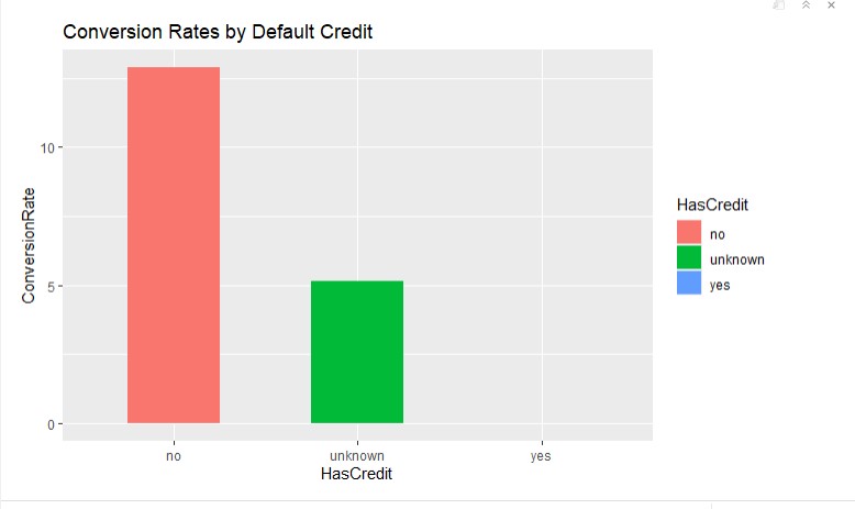
So if a client doesn’t have a credit, the one is more likely to subscribe to a term deposit.
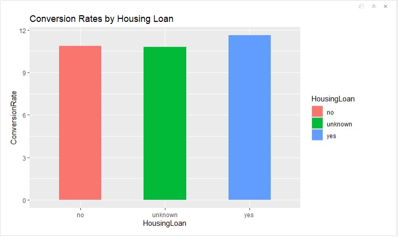
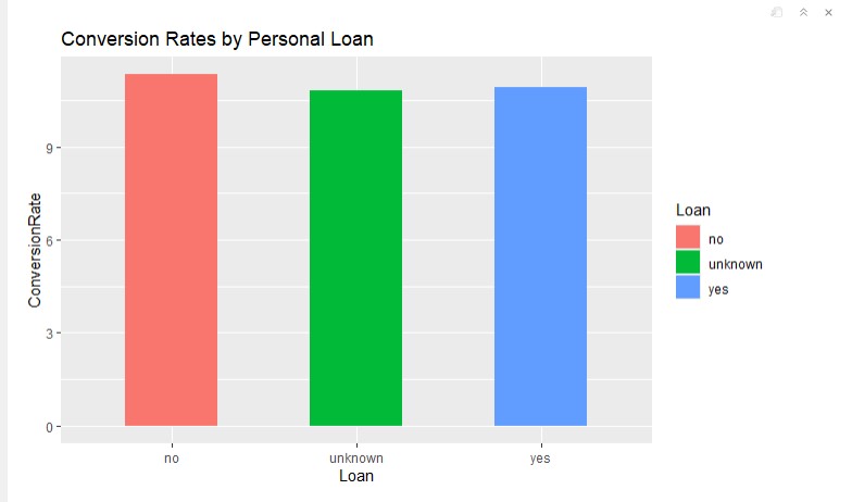
Conversions by having a housing loan and a personal loan
#group the data - housing loan
conversionsHousing <- data %>%
  group_by(HousingLoan=housing) %>%
  summarize(TotalCount=n(), NumberConversions=sum(y)) %>%
  mutate(ConversionRate=NumberConversions/TotalCount*100) %>%
  arrange(desc(ConversionRate))

#visualizing the data
ggplot(conversionsHousing, aes(x=HousingLoan, y=ConversionRate, fill=HousingLoan)) +
  geom_bar(width=0.5, stat = "identity") +
  labs(title="Conversion Rates by Housing Loan")
#group the data - personal loan
conversionsLoan <- data %>%
  group_by(Loan=loan) %>%
  summarize(TotalCount=n(), NumberConversions=sum(y)) %>%
  mutate(ConversionRate=NumberConversions/TotalCount*100) %>%
  arrange(desc(ConversionRate))

#visualizing the data
ggplot(conversionsLoan, aes(x=Loan, y=ConversionRate, fill=Loan)) +
  geom_bar(width=0.5, stat = "identity") +
  labs(title="Conversion Rates by Personal Loan")
Conversions by contact type
conversionsContact <- data %>%
  group_by(Contact=contact) %>%
  summarize(TotalCount=n(), NumberConversions=sum(y)) %>%
  mutate(ConversionRate=NumberConversions/TotalCount*100) %>%
  arrange(desc(ConversionRate))

head(conversionsContact)
 Cellular type of contacting clients is more efficient
Conversions by the last contact month of a year
# group the data by months
conversionsMonth <- data %>%
  group_by(Month=month) %>%
  summarize(TotalCount=n(), NumberConversions=sum(y)) %>%
  mutate(ConversionRate=NumberConversions/TotalCount*100) %>%
  arrange(desc(ConversionRate))

#reorder DESC
conversionsMonth$Month <- factor(conversionsMonth$Month,
                                   levels = conversionsMonth$Month[order(-conversionsMonth$ConversionRate)])
#visualizing the data
ggplot(conversionsMonth, aes(x=Month, y=ConversionRate)) +
  geom_bar(width=0.5, stat = "identity", fill="darkgreen") +
  labs(title="Conversion Rates by Last Contact Month") +
  theme(axis.text.x = element_text(angle = 90))
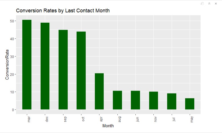 People who were contacted last time in March, December, September, and October convert much better than others.
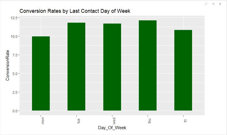
Conversions by the last contact day of a week
#group the data by days of a week
conversionsDayOfWeek <- data %>%
  group_by(Day_Of_Week=day_of_week) %>%
  summarize(TotalCount=n(), NumberConversions=sum(y)) %>%
  mutate(ConversionRate=NumberConversions/TotalCount*100) %>%
  arrange(desc(ConversionRate))

#reorder DESC
conversionsDayOfWeek$Day_Of_Week <- factor(conversionsDayOfWeek$Day_Of_Week,
                                           levels = c("mon", "tue", "wed", "thu", "fri"))
#visualizing the data
ggplot(conversionsDayOfWeek, aes(x=Day_Of_Week, y=ConversionRate)) +
  geom_bar(width=0.5, stat = "identity", fill="darkgreen") +
  labs(title="Conversion Rates by Last Contact Day of Week") +
  theme(axis.text.x = element_text(angle = 90))
Correlation between subscribing to a term deposit and call duration
##
data_duration <- data %>%
  group_by(Subscribed=y) %>%
  summarise(Average_Duration=mean(duration))
head(data_duration)

The average duration of a successful call is more than 2 times longer.
Conversions by the number of contacts performed during the campaign
conversionsCamp <- data %>%
  group_by(Campaign=campaign) %>%
  summarize(TotalCount=n(), NumberConversions=sum(y)) %>%
  mutate(ConversionRate=NumberConversions/TotalCount*100) %>%
  arrange(desc(ConversionRate))

head(conversionsCamp)
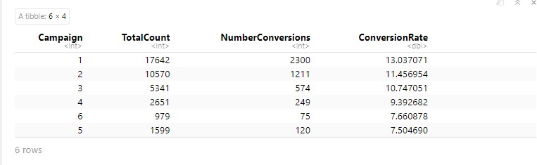
If you look at the full data (not just a head), you will notice that after 18 (the number of contacts performed during this campaign and for this client) conversion rate is 0. So there is no point to call clients more than 18 times during one campaign).
Conversions by the outcome of the previous campaign
#group the data by the previous outcome
conversionsPOutcome <- data %>%
  group_by(Previous_Outcome=poutcome) %>%
  summarize(TotalCount=n(), NumberConversions=sum(y)) %>%
  mutate(ConversionRate=NumberConversions/TotalCount*100) %>%
  arrange(desc(ConversionRate))

# visualizing the data
ggplot(conversionsPOutcome, aes(x=Previous_Outcome, y=ConversionRate)) +
  geom_bar(width=0.5, stat = "identity", fill="darkgreen") +
  labs(title="Conversion Rates by Outcome of the Previous Campaign")
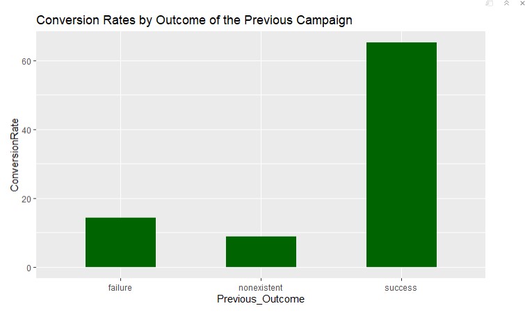
Obviously, if the previous campaign outcome was successful (the bank probably earned some loyalty), this campaign converted better as well.
#Summarizing recommendations for the bank
During the Bank Marketing Campaigns Dataset analysis, I found some interesting insights that can be used for improving a similar marketing campaign, launching new campaigns, and addressing the Bank’s marketing strategy.
Target audience
Based on the performance of different groups, I found that young people - age 20-30 and students, as well as retired people 60+, are more likely to become clients. So I would suggest focusing on these two groups and create different financial programs and marketing messages in advertising for each.
Also, I would recommend creating a marketing campaign for people who didn’t have any credits before (explaining how it works and what are the benefits).
Recommendations for the Sales Department (Call Center)
-
Always contact clients by cellphone when possible
-
Perform most calls (campaigns) during these months: March, December, September, and October
-
Plan most calls to clients on Thursday, Tuesday, Wednesday
-
Long phone conversations perform better, so try to keep a conversation going as much as you can
-
18 is probably the max number of calls to a single client during a campaign
Loyalty Programm
- I would highly recommend developing a loyalty program for the existing clients by giving them some bonuses and unique offers. The data shows that loyal clients most likely buy more products.